
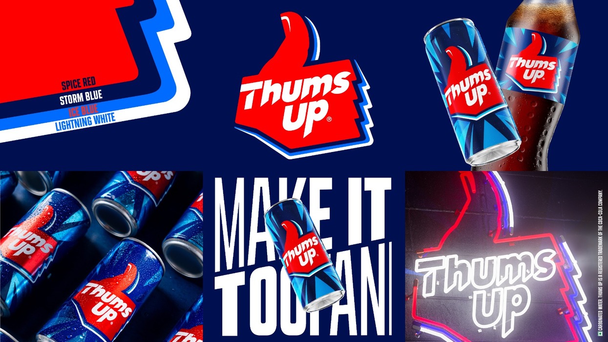
Thums Up, India’s iconic homegrown cola, has long been recognised by its unmistakable logo and unmistakably bold personality. Now, the brand has unveiled a striking new visual identity—one that signals a purposeful shift and mirrors a new India driven by ambition, confidence, and an unstoppable urge to make every moment count.
Developed by Thums Up’s in-house design team in collaboration with design agency SUPERULTRARARE®, this rebrand marks the cola’s first major visual evolution in over two decades. Rooted in a powerful legacy yet designed for the future, the refreshed identity introduces a more dynamic, explosive brand world. Since its inception, the Thums Up logo has evolved only three times, with each refresh reflecting changing youth codes and the ever-evolving spirit of young India. This latest iteration carries forward that tradition—honouring memory structures while boldly stepping into the now.
Thums Up XForce debuts with All Thunder, No Sugar On Zepto’s First-Ever Pre-Booking Exclusive
The new brand identity strikes a fine balance between familiarity and freshness. It retains the impact and strength of Thums Up’s distinctive visual assets while infusing them with a progressive, contemporary edge. Sharper, more chiseled typography enhances the brand’s bold stance, while the signature tri-colour palette—spiced red, iced blue, and storm blue—draws from its rich heritage. Together, these colours evoke strong taste, thunderous refreshment, and an adventurous, fearless personality. Thoughtful dynamic detailing preserves the human essence of the iconic thumb-mark, reinforcing the brand’s enduring Toofani spirit. The refreshed logo has also been optimised for the future, ensuring consistency across digital screens and a stronger, more impactful presence on retail shelves.
Commenting on the evolution, Sumeli Chatterjee, Senior Director, Sparkling Flavours, Coca-Cola India and Southwest Asia, shared that for nearly five decades, Thums Up has been a defining force in youth culture—symbolising boldness, confidence, and relentless energy. She added that the new visual identity is a strategic step forward, strengthening cultural relevance while unlocking the next phase of growth with a more dynamic and exciting brand world.
Nestlé Brings Morung-Themed NESCAFÉ & MAGGI Experience to Hornbill Festival
Matthew Kenyon, Founder of SUPERULTRARARE®, echoed this sentiment, noting that the refreshed identity distils the core essence of Thums Up—strong, resilient, and iconic—reimagined for today’s Indian youth by preserving what they love while amplifying what lies ahead.
Launched in 1977 as India’s first homegrown cola, Thums Up has consistently reshaped the category with its bold, spicy taste and fearless positioning. From iconic campaigns like Taste The Thunder, Aaj Kuch Toofani Karte Hain, Palat De, and Soft Nahin Toofan to innovations like Thums Up XForce—now the country’s largest no-sugar drink within six months—the brand continues to inspire generations. As it looks ahead, Thums Up’s new visual identity sharpens a legacy that has always moved with the times, setting the stage for its next unapologetically Toofani chapter.


